


Branding
Guidelines
Break the Grid is a creative studio for brands that lead with purpose; blending strategy, storytelling, and digital design.
Brand-first thinking for tech, industrial, and luxury retail sectors; made to resonate and perform.

What We Do
Design-led solutions for brands that build, shape, and scale.

Creative Direction
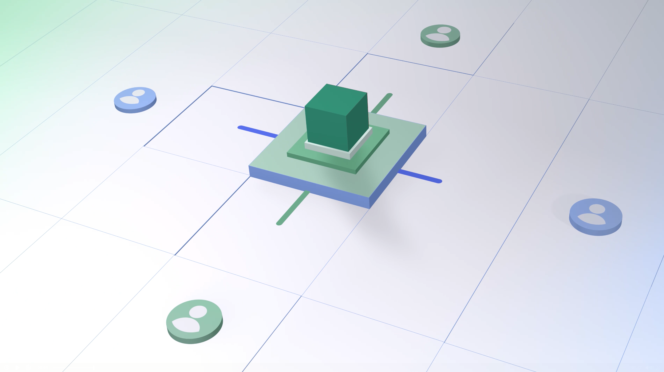
3D Product Visualization

Motion Design & Animation

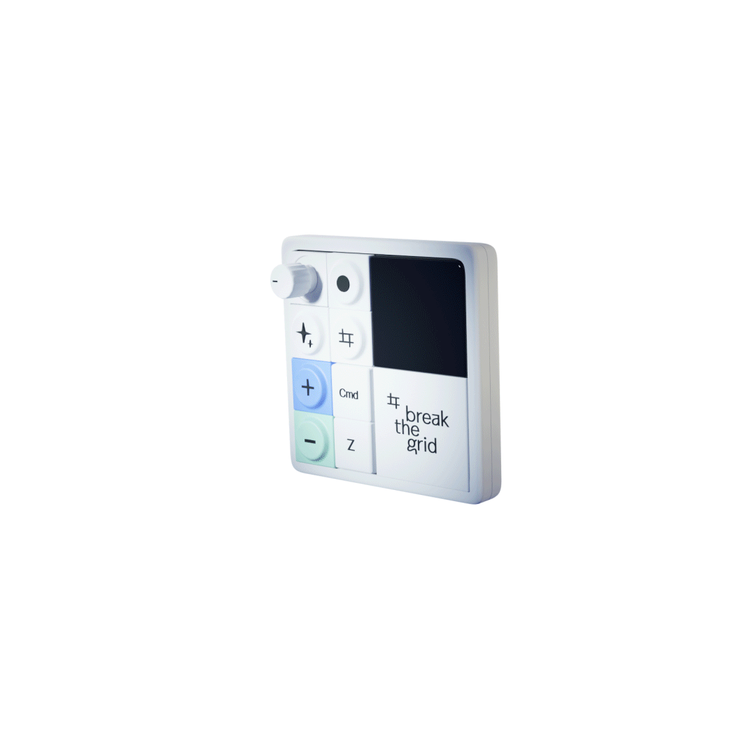
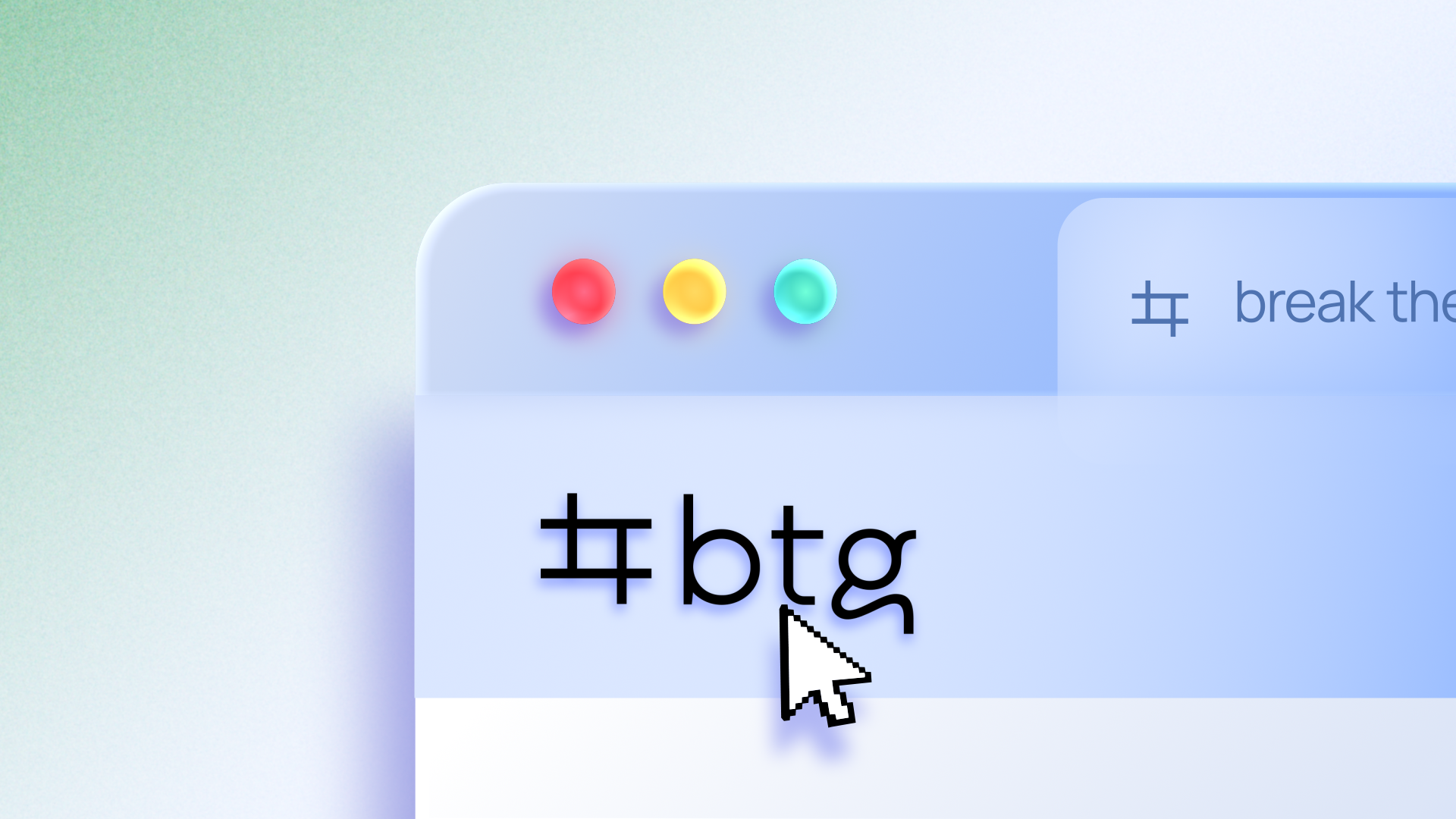
Frame to Break
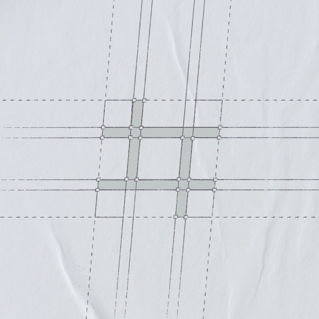
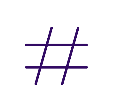
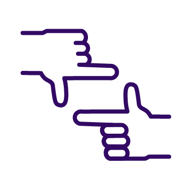
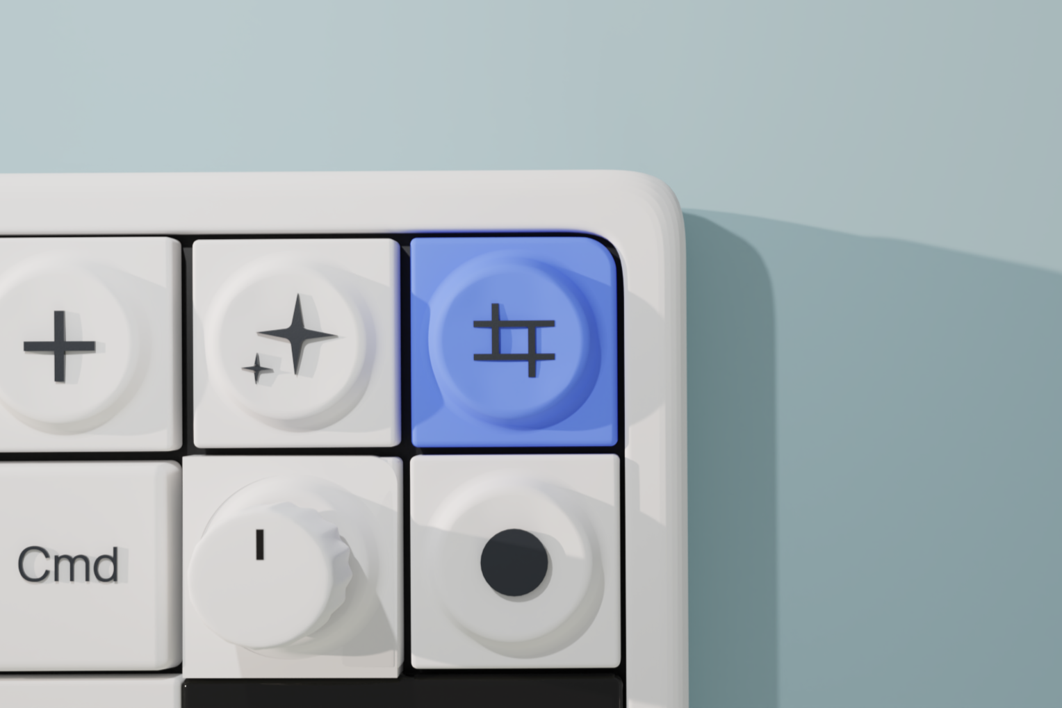
The monogram in the top-left of Break the Grid asserts itself with quiet confidence, inspired by three creative realms: graphic, video, and digital. Their influence is felt through form, implied motion, and a balance of precision and openness.
The logotype reflects the agency’s spirit: an immersive identity driven by going beyond expectations.

Colors
Midnight
Denim Blue
Sky Wash
Pale Cloud
Deep Teal
Evergreen
Mint Leaf
Soft Frost
Color Usage
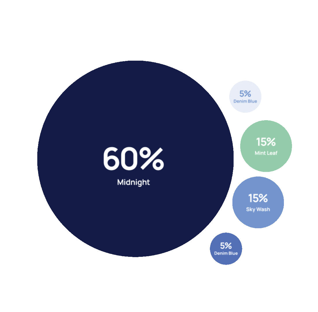
The brand palette is built on a clear hierarchy of proportion. Midnight is the primary color, making up the majority of applications to establish a strong and consistent foundation.
Secondary colors like Mint Leaf and Sky Wash are used in smaller proportions to support and balance the design, adding clarity and visual interest.
Accent colors should be applied sparingly to highlight key elements and guide attention. Maintaining these proportions ensures consistency and a cohesive brand presence across all touchpoints.

Secondary Colors
Color System
The secondary palette is applied sparingly as a set of spot colors, designed to create contrast, draw attention, and amplify the presence of blue rather than compete with it.
Together, this hierarchy forms a cohesive and flexible color system that is purposeful,

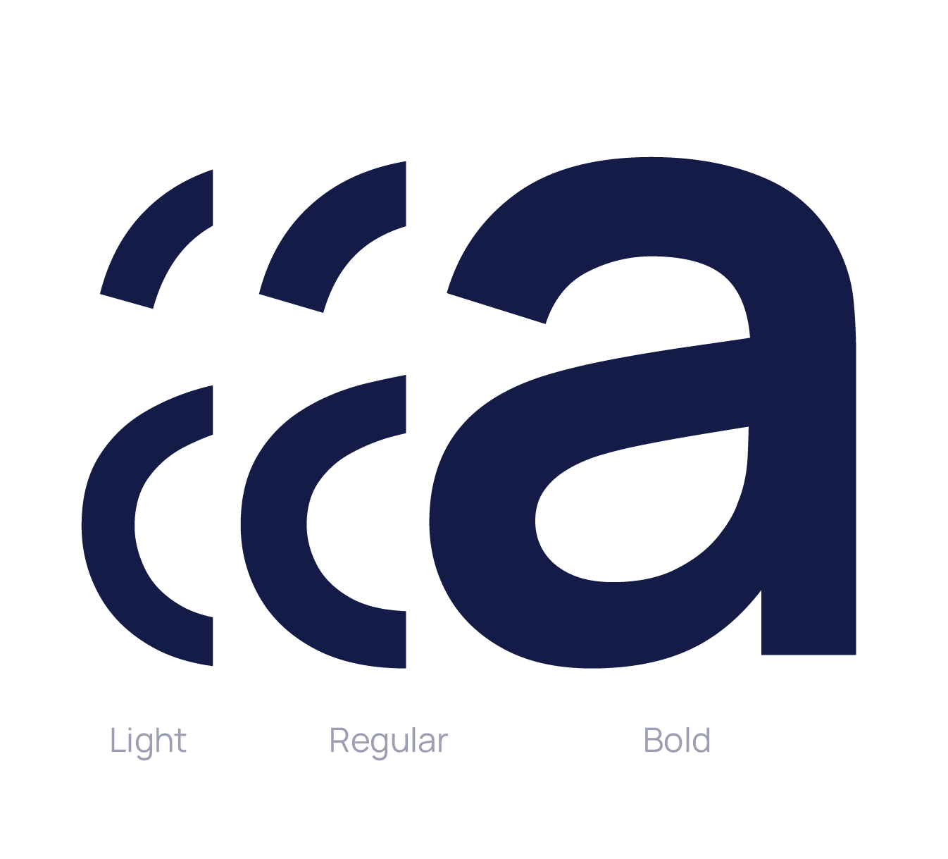
Manrope
Designed by Mikhail Sharanda, this neo-grotesque sans serif combines modern precision with a subtle human touch. As a variable font, it offers flexible weights and styles, making it ideal for digital interfaces and branding. Its clean, balanced forms create a calm, professional look that remains approachable and versatile.
ABCDEFGHIJKLMNOPQRSTUVWXYZ
abcdefghijklmnopqrstuvwxyz
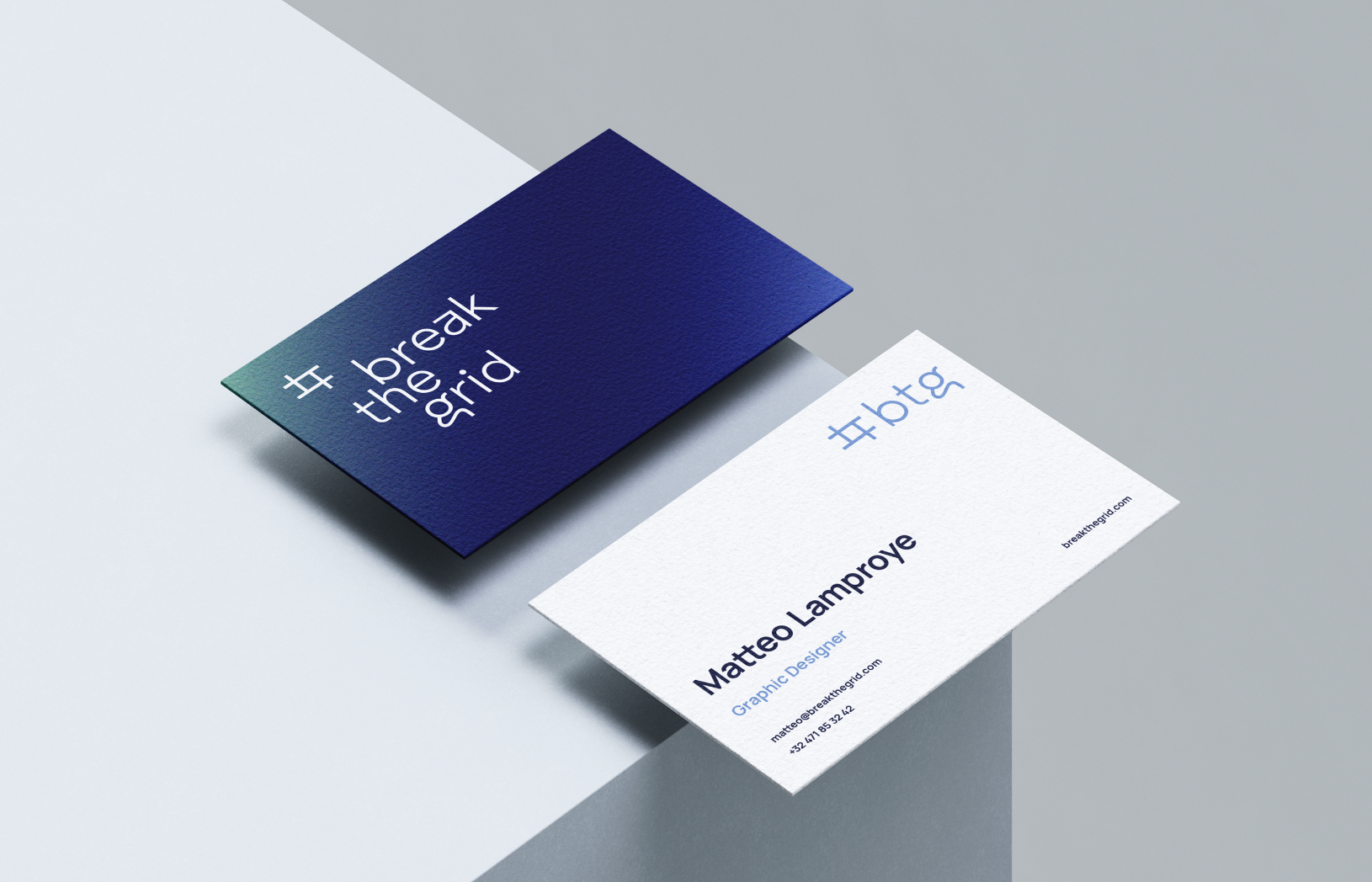
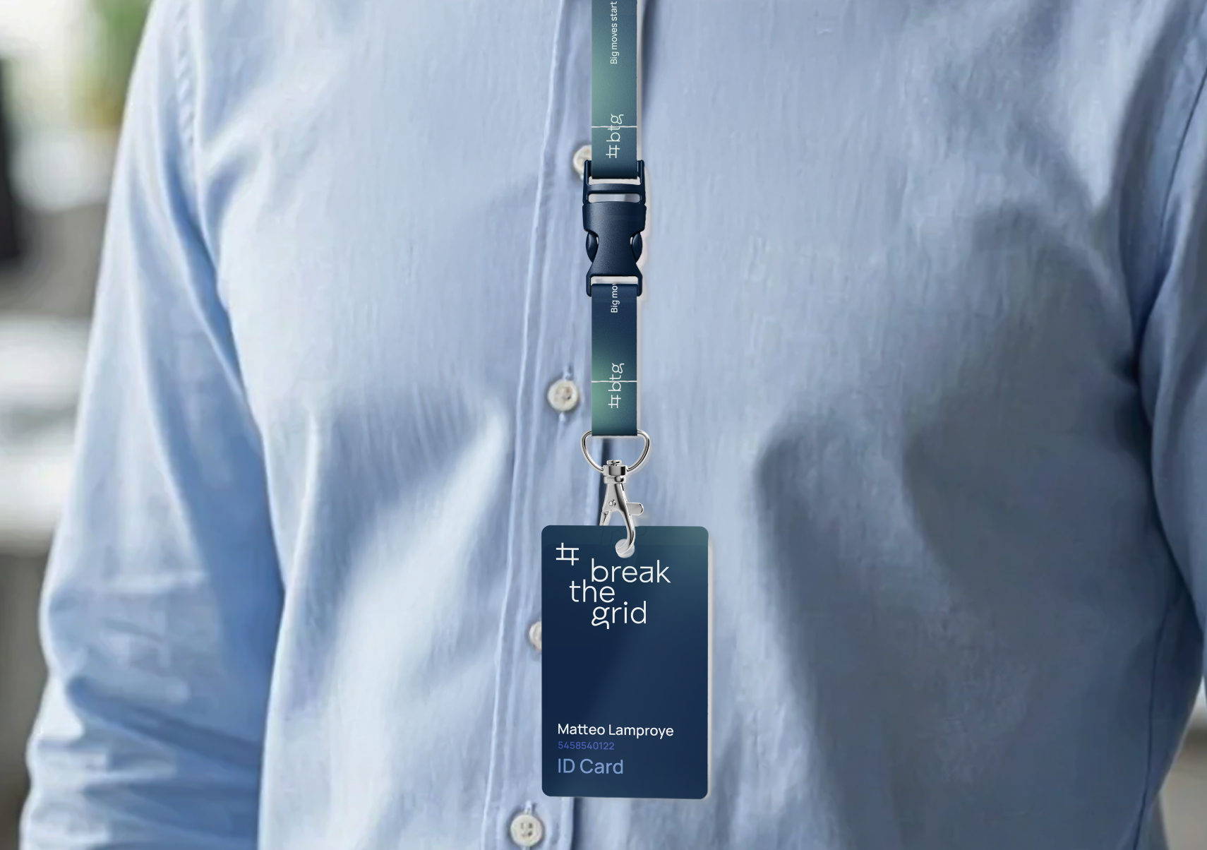
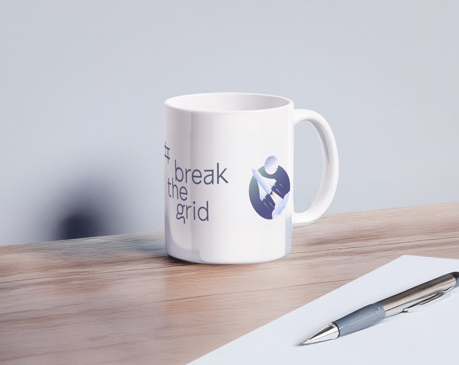
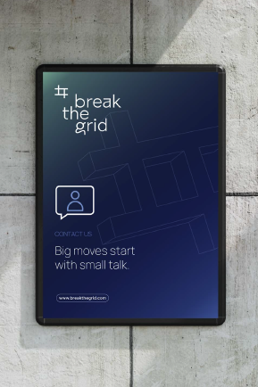
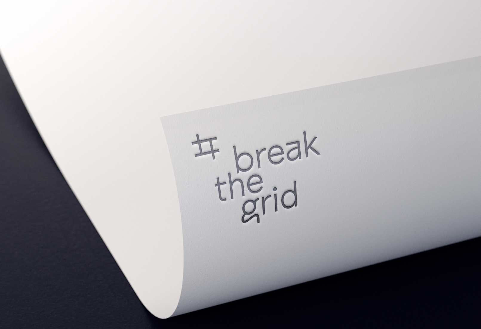
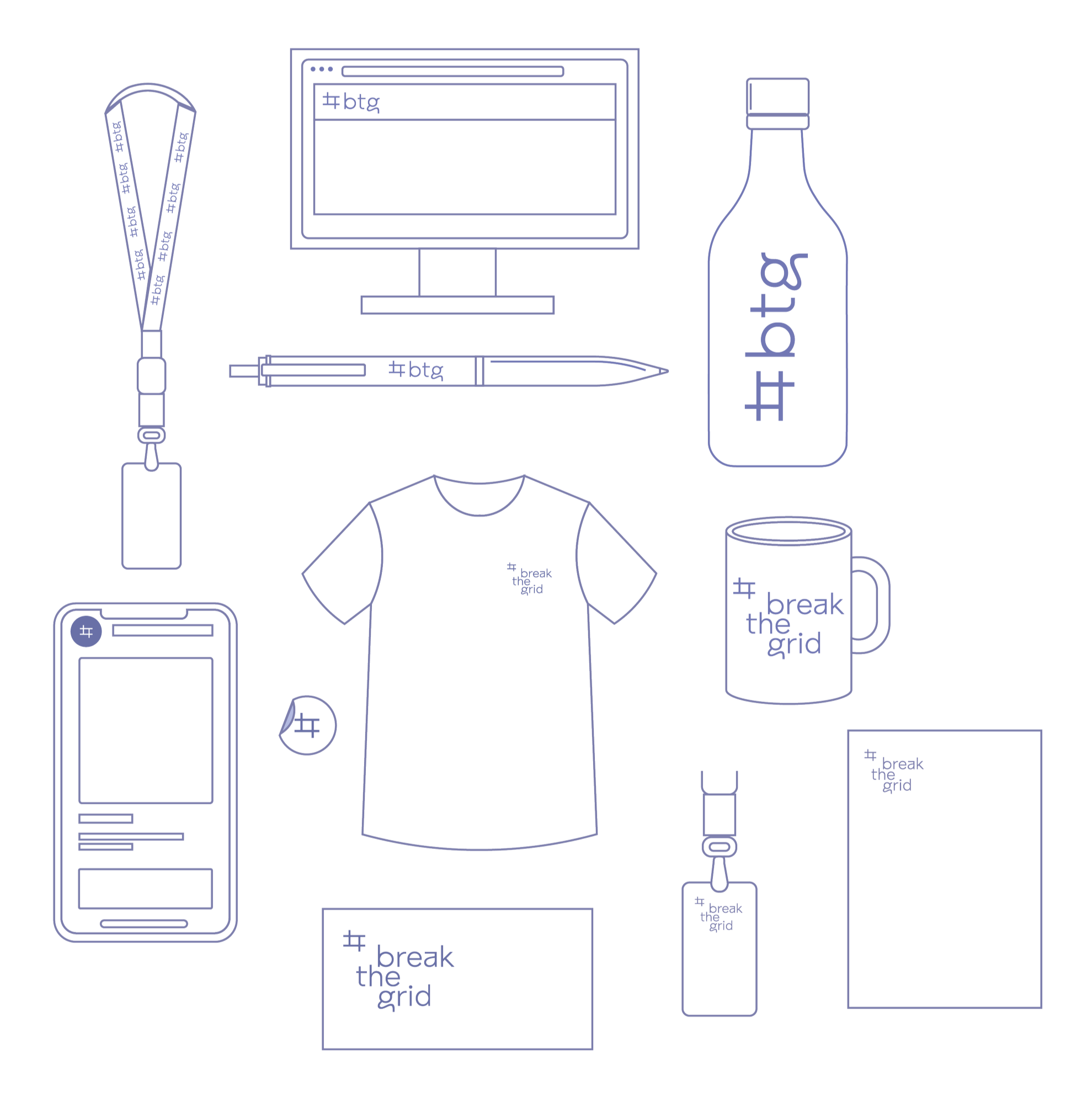
A brand designed for every touchpoint
The logotype, codename, and brand mark are designed to adapt and express themselves seamlessly across a wide range of applications from digital interfaces to physical objects, apparel, and print.
Each medium becomes an opportunity to reinforce the brand’s presence, ensuring consistency, clarity, and impact at every touchpoint.
The result is a cohesive identity that is not only seen, but experienced everywhere it lives.
Illustrations
A set of fluid, minimal animated illustrations designed to echo the spirit of Break the Grid. Soft gradients and geometric forms shift and evolve, visualizing ideas like experimentation, disruption, and creative flow. Each motion piece breaks away from rigid structures, reinforcing a brand identity that challenges convention and embraces dynamic thinking.


Commercial Narrative Thinking
Interactive Visual elements

Multimedias

Growth


Motion Design
Artistic Direction

3D Product Visualization

Retail Technology

Explainer Video

Fast Execution
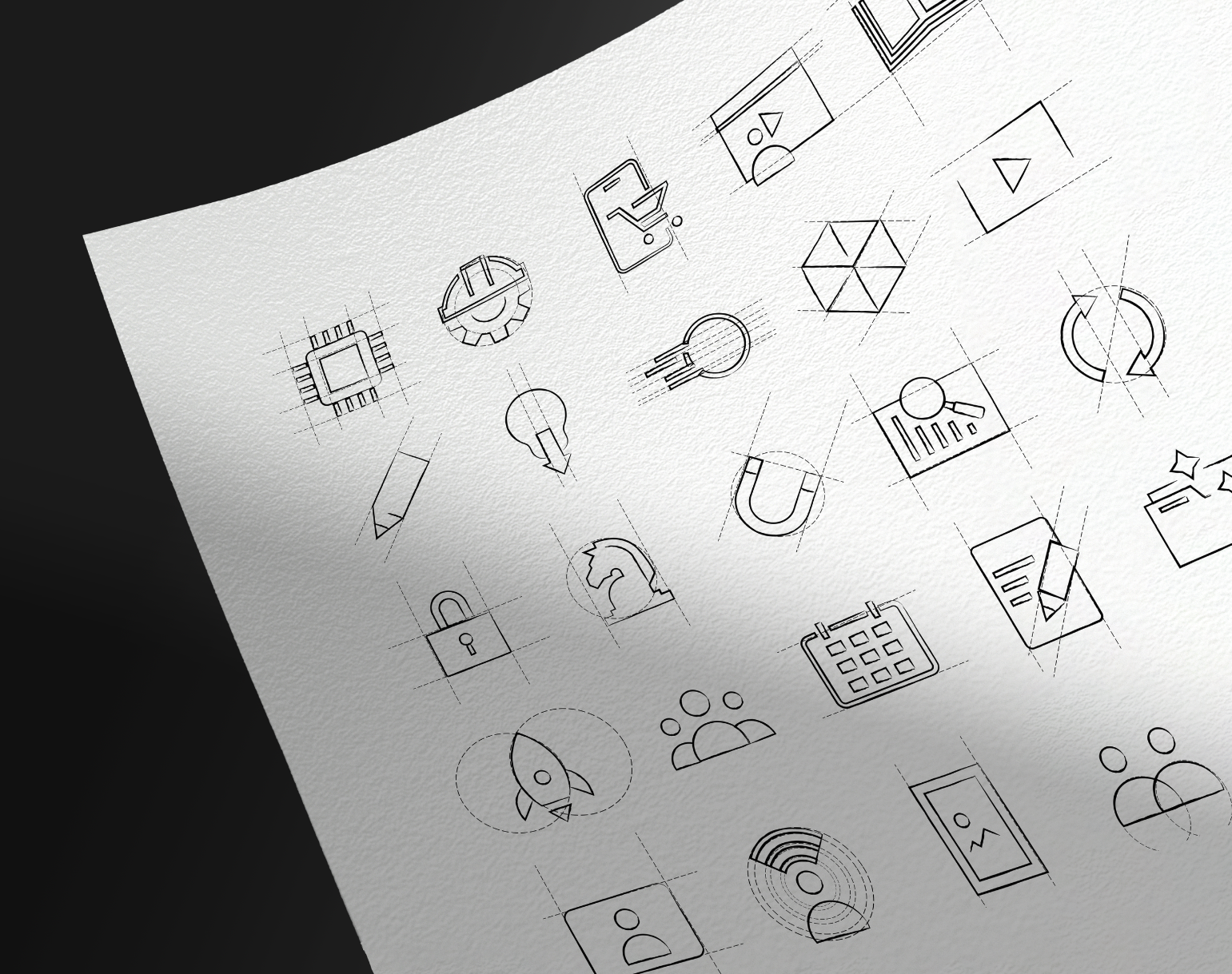
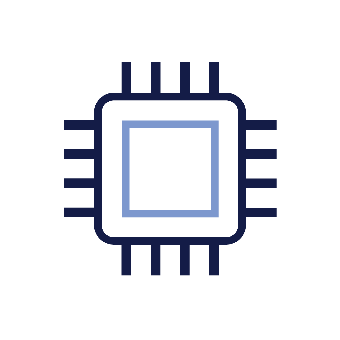
Icons


Active Campaign
Conversion


Expression
Intuition


Planning
Brand Strategy


Creative Direction
Graphic Design

KPIs
SaaS Technology


Connexion
Creative Portfolio


Growth
Lead Generation

Video Production


Contact
3D Product Visualization
Industrial Features
Creativity


Academy
Methodology & Team


E-Commerce
Content Creator


Motion Design
Intellectual Property
Explainer Video
Our motion design is an extension of the brand system. It exists to communicate clearly, reinforce identity, and create a consistent visual experience across all touchpoints. Every animation decision (timing, color, movement, composition) must support meaning, not decoration.


Let’s break the grid
At Break the Grid, we rethink the expected — and design what comes next.

